Logo Redesign:
Amazon Fresh
Senior Brand Designer, Design Manager
Brief
Update the Amazon Fresh logo in response to a few major shifts in the business: the acquisition of Whole Foods Marketing and the Amazon Fresh service becoming free for Prime members.
Strategy
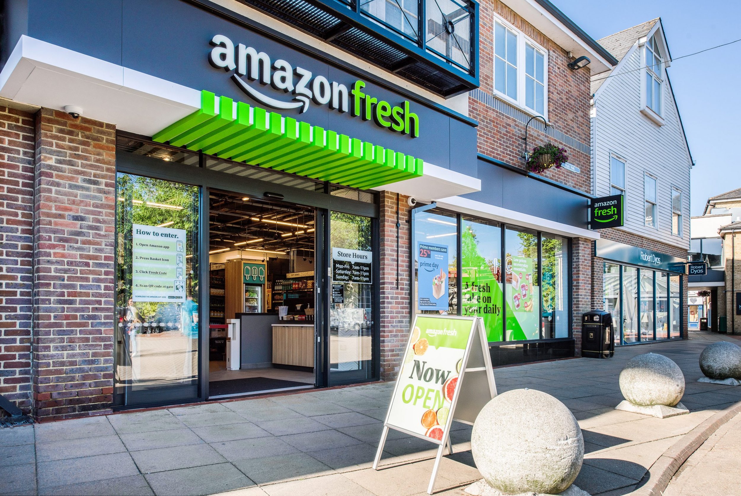
The Whole Foods Market logo was very similar to the brand identity of Fresh and we wanted to make more of a distinction. Both include a green leaf design in the logo type.
Secondly, there was an opportunity to align the new logo with the Prime brand. Prime members would now have access to this service, whereas before they had to pay a separate fee.
Responsibilities
I proposed aligning the Amazon Fresh logotype more closely with Amazon Prime by utilizing Amazon’s custom typeface, Amazon Ember. Leadership approved my initial pitch, and after thorough color research, my Creative Director and I selected a vibrant green—a subtle shift from the previous, more subdued green used in the logo.
The new logo continues to connect with the parent brand, Amazon and redesigns Fresh to be inline with the Prime logo, which uses the branded typeface Amazon Ember.
Roll out


